Rebuilding Grafana's Design System as an AI-Ready Foundation
Primary Goals
1. Stop the proliferation of one-off components in design and code by building a strategic design system that aligns design and engineering.
2. Create consistent core UI components with clear context to empower AI-accelerated quality instead of technical debt.
3. Establish tooling to maintain the system and keep it aligned.
My Process
Assessing the Current State
When I started on Grafana's marketing website, AI-accelerated development had produced a sprawl of duplicated components with no shared styles or functionality. Design and engineering weren't short on goodwill; they were working from different sources of truth. Of the 328 token entries in Figma, 19% had overlapping values and 21% were missing or wrong in code, so roughly one in five design decisions wouldn't match what shipped.
Before tackling components, I needed to build a token foundation both teams could rely on.
Building a Primitive Layer
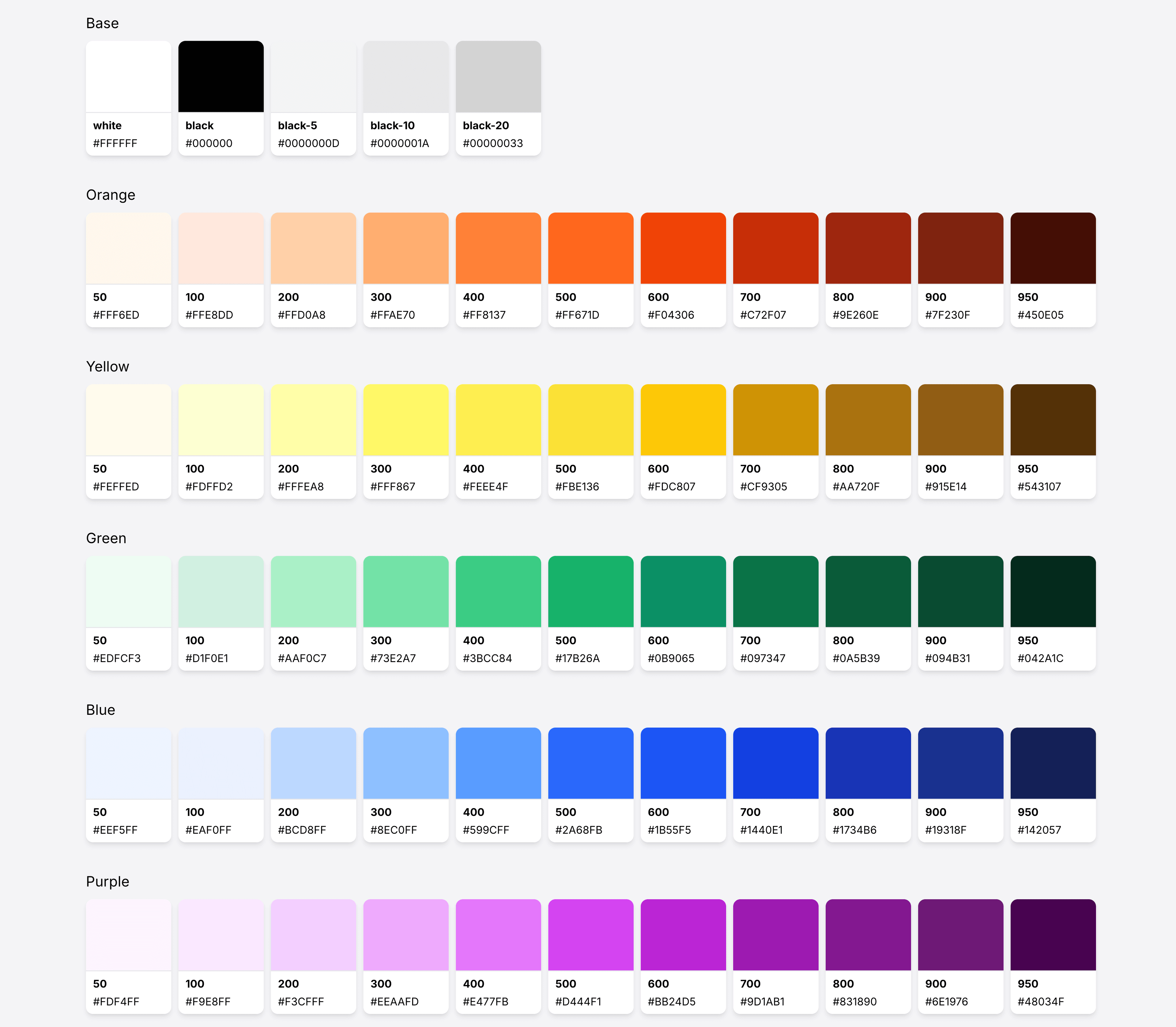
First, I cleared the noise in Figma: removing unused values, consolidating duplicates, and using AI to migrate hundreds of color references. Color primitives dropped from 257 to 137, so designers had one neutral ramp instead of five. I then added primitives that existed in code but not Figma, and aligned the spacing, radius, and typography scales to code. Code was the right source to align to: earlier cleanup had given it the clearer foundation, and feature work was ongoing, so code changes had to stay non-breaking. The result was 203 unique primitives, with every existing reference remapped to them.
I also wrote a skill and scripts to export tokens from Figma as W3C Design Token JSON and convert them into CSS variables for the Tailwind theme. That let me remove the last duplicated color ramps from the codebase and document the primitives in Storybook, the first step toward making Storybook the system's source of truth.
Adding Meaning with Semantic and Component Tokens
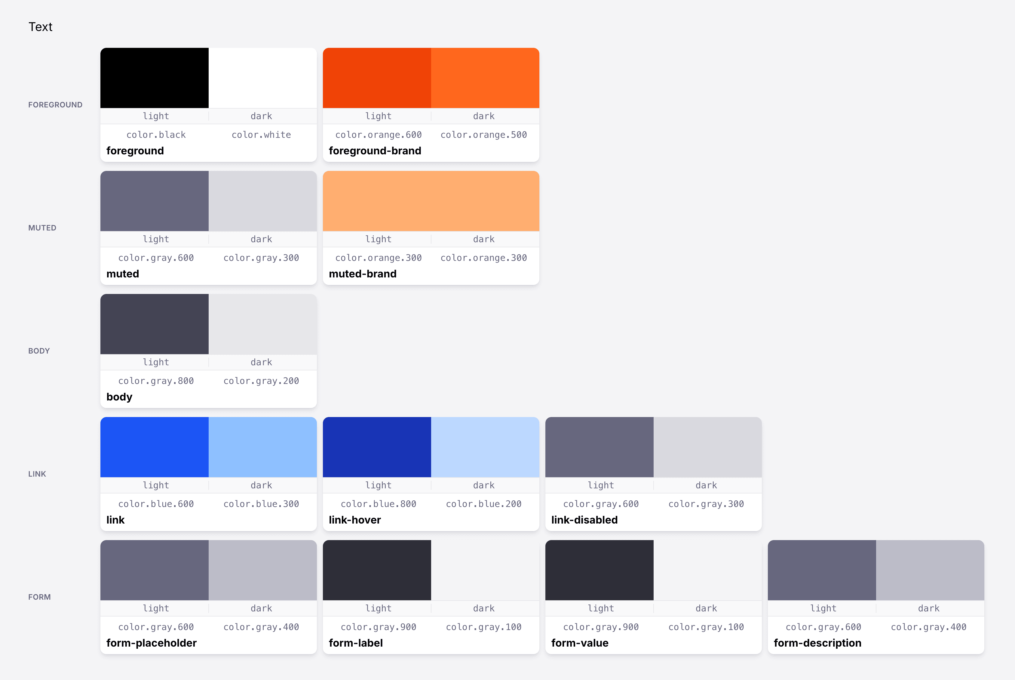
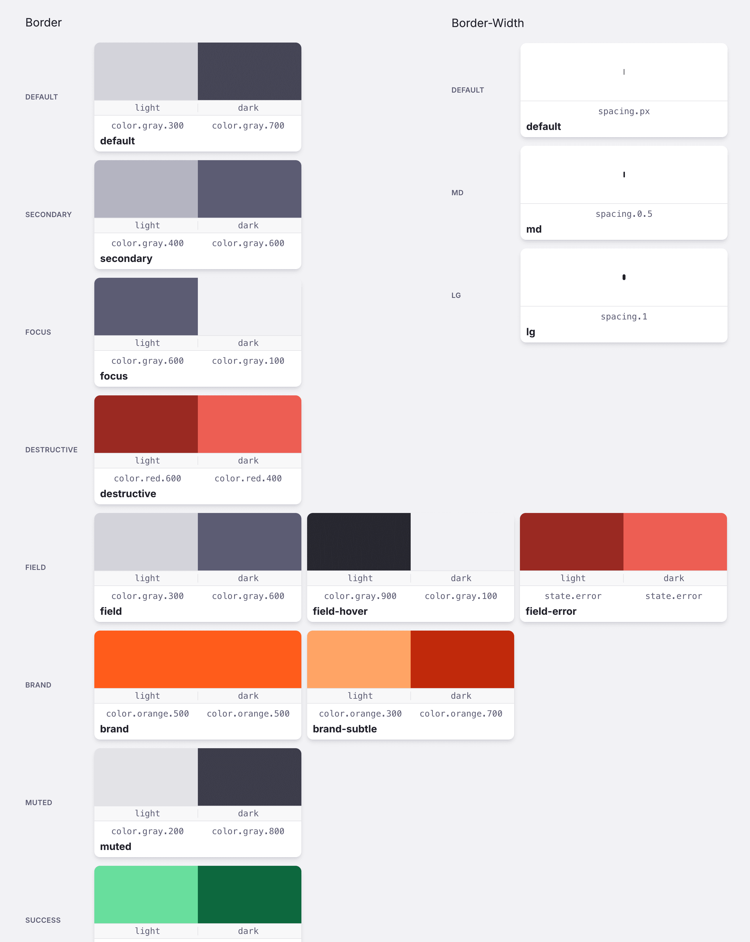
Primitives describe what a value is; semantic tokens describe how it's used. I created 156 semantic tokens covering spacing, corners, borders, forms, typography, and color, building in contrast compliance, light/dark theming, and a consistent type hierarchy.
Semantic tokens do most of the work, so designers and engineers rarely reach for primitives. Fewer decision points leave fewer places for drift.
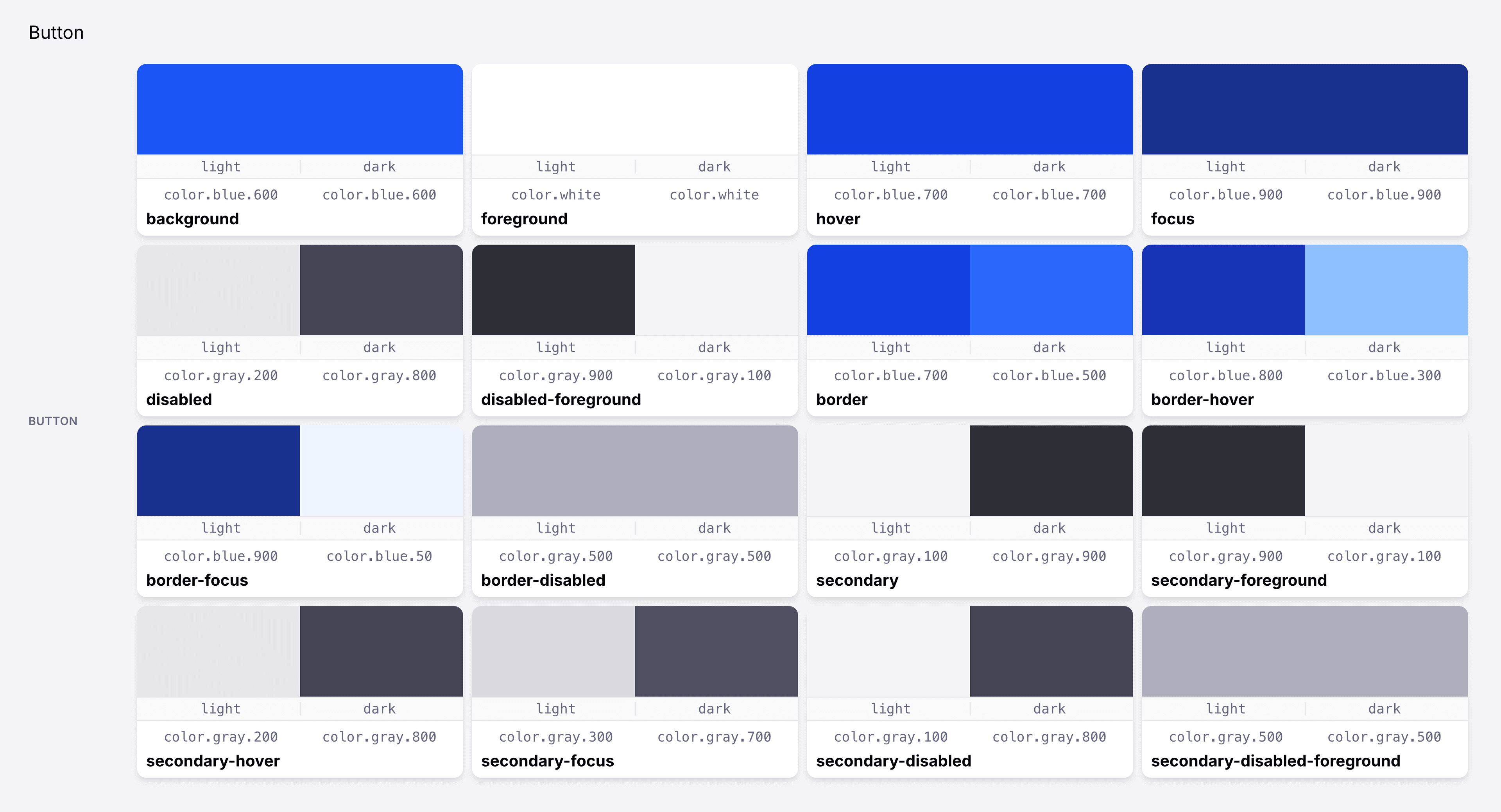
For components like buttons that don't map cleanly to semantic tokens, I added a minimal component layer, with guidance on when a token belongs there. Rolling both layers out in Figma took 2,800+ non-breaking changes without disrupting in-progress work. The codebase followed during component renovations.
Auditing Components and Creating a Roadmap
Next, I audited Figma and the codebase for components missing from one side or mismatched between them. I turned the findings into a task list with effort estimates, noting whether each fix belonged in Figma, code, or both. The roadmap gave stakeholders visibility into progress and gave agents clear direction.
Renovating Components
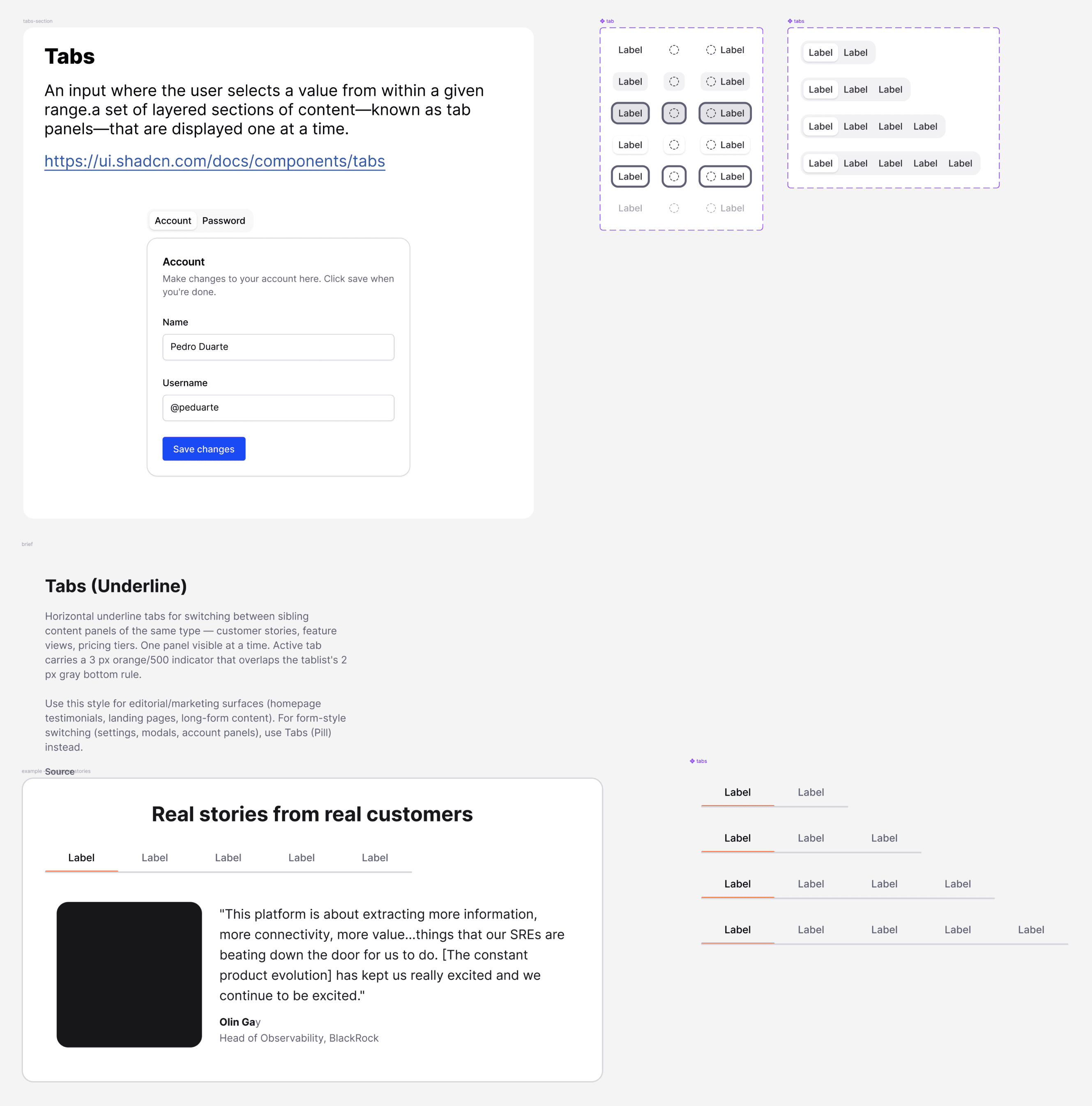
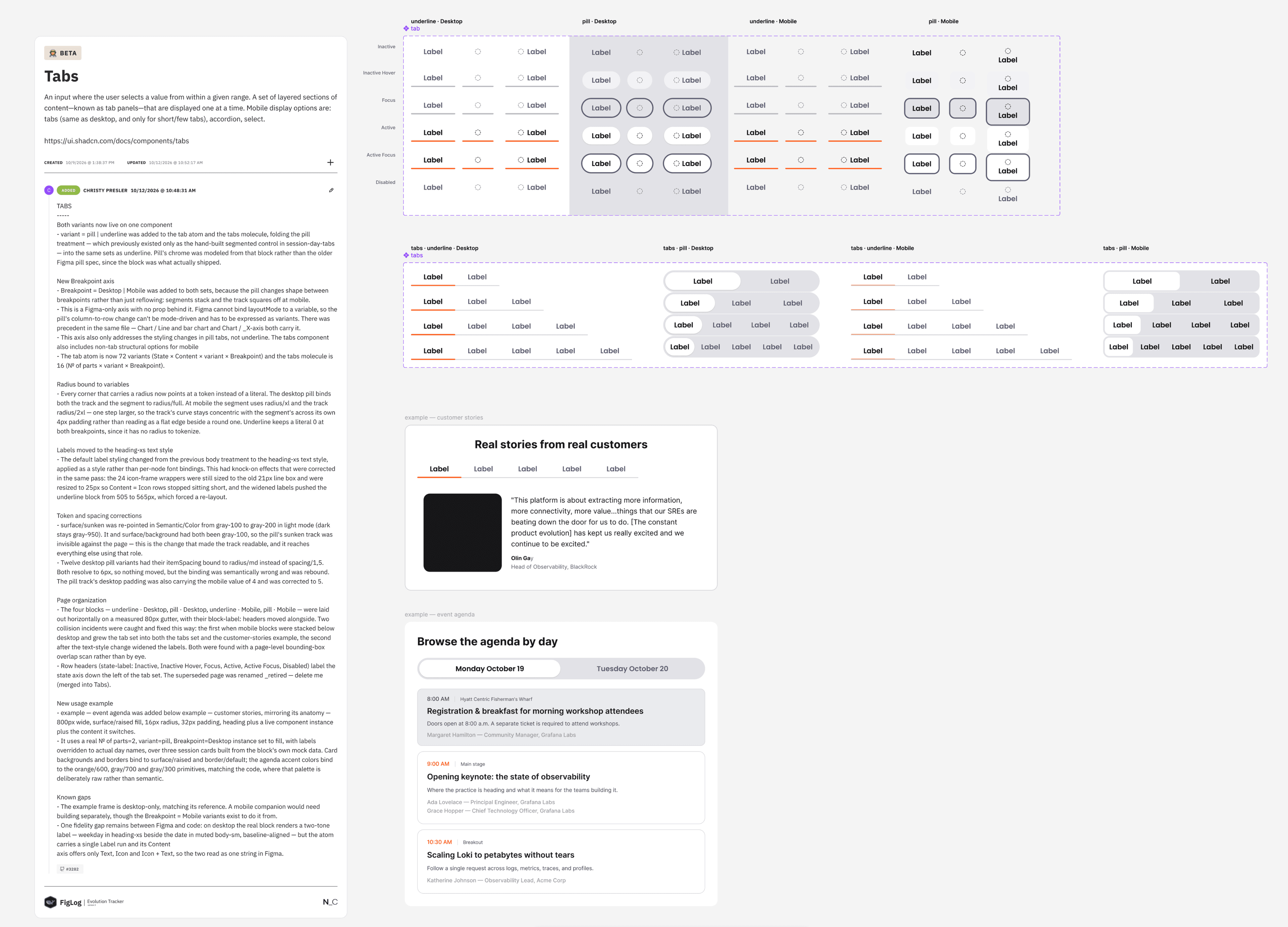
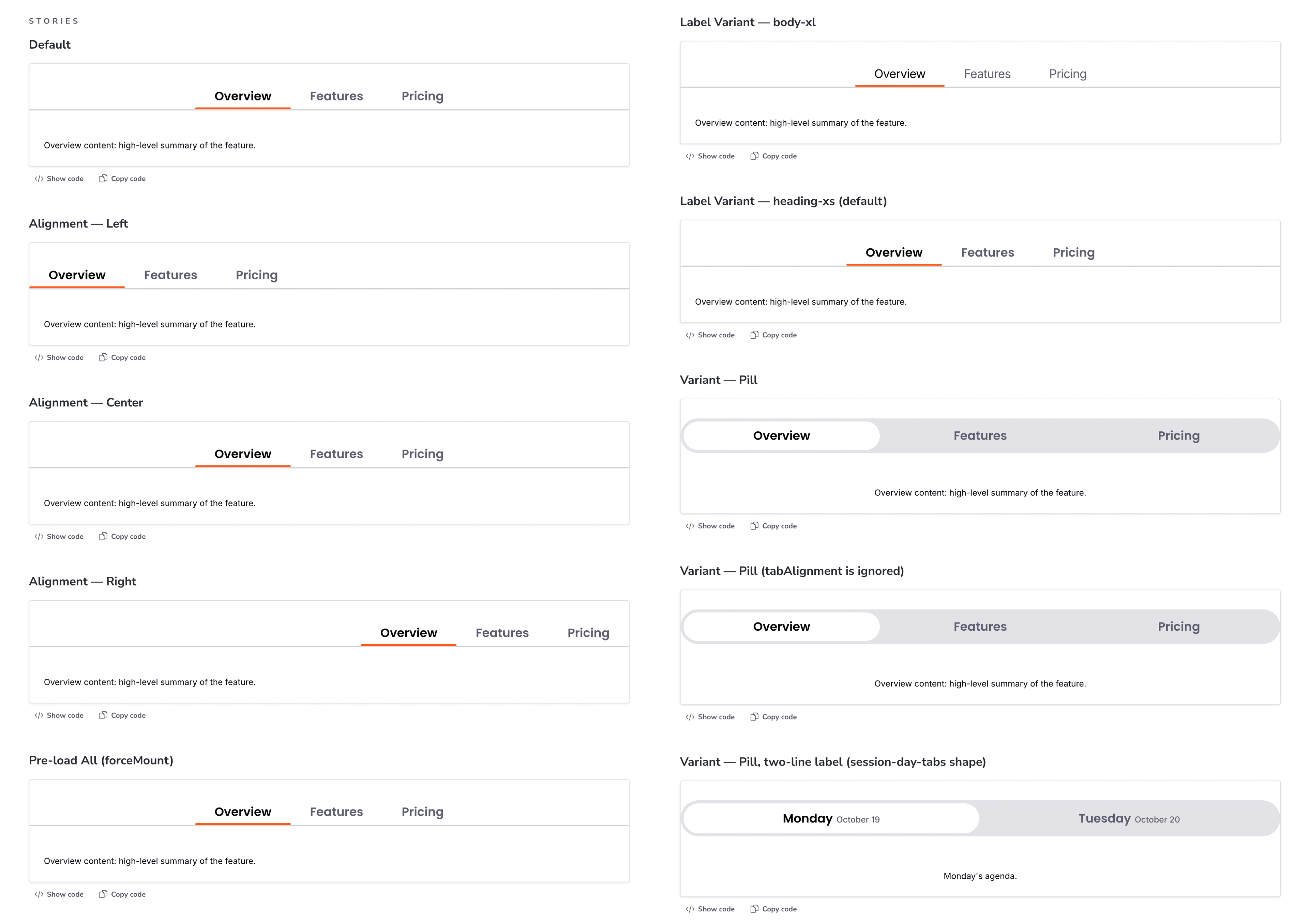
Each component was aligned to the new tokens and its coded counterpart, added to Storybook, documented in a guideline.md, tested, and shipped to production. Outdated components were removed or replaced along the way. To refactor production components safely, I set up visual regression testing in CI/CD across the system and its consuming apps, catching unintended changes before launch.
Keeping It Synchronized
Synchronization only matters if it lasts, so I built guardrails into everyday workflows.
Guidelines for people and agents. I documented clear rules for token and component management through skill and guideline files, so the same source of context was available to designers, engineers, and AI agents alike.
Token linting. Linting flags out-of-compliance tokens where they occur, so migration happens during normal development instead of as a separate project.
Design token proposals in real environments. Designers propose token changes through a custom Figma plugin I created that triggers a GitHub Actions workflow and opens a PR with the changes. Design and engineering review and approve them together in a real staging environment instead of static mock-ups.
Storybook as the Source of Truth
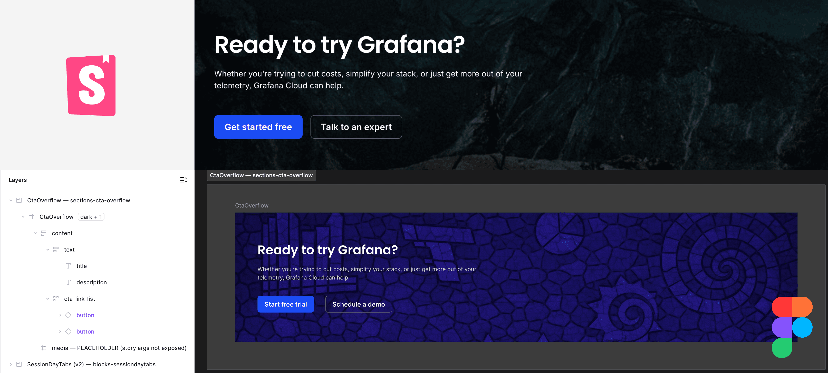
Designers also need current versions of complex components built from the core system, but hand-maintaining a Figma copy of Storybook's full library is costly. I built a skill that uses the Storybook MCP to generate those components in Figma from the latest Storybook definitions. Nobody has to rebuild them by hand, and Storybook has become the design team's source of truth for production components.
Better Inputs, Better Agent Output
With new designs built from the core library and system standards, agents work from comprehensive guidelines and well-structured Figma files. That cut feature development time by 68% and earned praise from both teams.
What I Learned
Clear foundations can feel like a slowdown to teams who want to move fast, but AI makes them more important than ever. Here, the missing structure was the root of the collaboration struggles. A shared structure sped up feature work and improved morale on both teams.
With the roadmap and foundations in place, I renovated, documented, and shipped 30+ production-quality components in Figma and code in under a month without breaking production or design workflows. That wouldn't have been possible before agentic engineering.